When it comes to data visualization in Python, Seaborn stands out as one of the most powerful and user-friendly libraries. Mastering Data Visualization with Seaborn Python Tutorial Built on top of Matplotlib, Seaborn offers a high-level interface that makes complex plots easy to create. If you’re a data analyst, data scientist, or simply someone interested in making your data more insightful, Seaborn is a fantastic tool to have in your arsenal. By simplifying visualization tasks and offering beautiful, easy-to-read graphs, Seaborn enables you to uncover trends, patterns, and relationships in your data effortlessly.
Why Use Seaborn?
One common question is: why choose Seaborn over Matplotlib? While Matplotlib is a foundational visualization library and provides fine-grained control, it often requires a lot of boilerplate code to achieve an attractive plot. Seaborn, on the other hand, simplifies many tasks by providing higher-level abstractions. Here are some of the key advantages of Seaborn over Matplotlib:
- Simplified Syntax: Seaborn wraps around Matplotlib, offering simpler, more intuitive functions, allowing you to create complex visualizations with less code. You don’t need to spend time customizing every element; instead, you get beautiful plots right out of the box.
- Built-in Themes: Unlike Matplotlib, which often requires manual adjustments to make plots look visually appealing, Seaborn provides aesthetically pleasing themes by default. With themes like
darkgrid,whitegrid, and more, Seaborn ensures your visuals are attractive with minimal effort. - Statistical Visualizations: Seaborn is designed specifically for statistical data visualization, making it easier to create plots that communicate relationships, trends, and distributions effectively. You can plot distributions, regression lines, and other statistical elements easily.
- Integrated with Pandas: Seaborn works seamlessly with Pandas DataFrames, allowing you to directly pass data without needing extra transformations. This tight integration makes the entire data analysis workflow smoother and more efficient.
Seaborn is specifically designed for statistical plotting. It brings simplicity to creating beautiful, informative graphs, especially when you’re working with large datasets. Here are some key reasons why Seaborn is preferred by many data scientists:
- Ease of Use: Seaborn provides functions that work seamlessly with Pandas DataFrames, which makes handling data extremely convenient. The straightforward syntax allows you to visualize data in just a few lines.
- Built-in Themes: Unlike Matplotlib, which often requires manual styling, Seaborn comes with several built-in themes that make visualizations aesthetically pleasing right out of the box. You don’t have to worry about the tedious task of manually setting colors, grids, or styles.
- Rich Visuals for Relationships: Seaborn excels in visualizing relationships between multiple variables using scatter plots, heatmaps, pair plots, and more. You can use color (
hue), size (size), and style (style) to add multiple dimensions to your plots effortlessly.
Getting Started with Seaborn
Before diving into the details, you need to make sure Seaborn is installed in your environment. If it’s not already installed, simply run:
pip install seabornNow, let’s dive into some of the most common Seaborn plots and explore how they can help you understand your data better. Seaborn offers an extensive range of functions that allow you to visualize distributions, relationships, categorical data, and more, all with just a few lines of code.
1. Loading Data with Seaborn
Seaborn comes with a few built-in datasets that you can use to practice visualization. For example, the tips dataset is great for learning purposes:
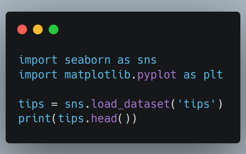
This dataset contains information about restaurant bills, including variables like total bill, tip, gender of the customer, and more. These built-in datasets are ideal for practicing different types of visualizations without the need to import external data sources.
2. Creating Basic Plots
A. Scatter Plot
Scatter plots are ideal for exploring relationships between two continuous variables. In Seaborn, you can use sns.scatterplot():
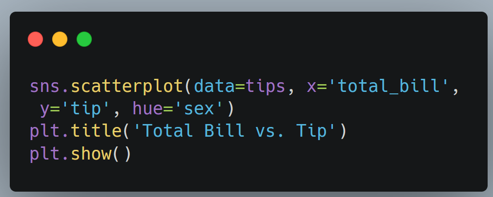
The hue parameter lets you add another layer of information to the graph by coloring points based on categories, such as gender in this case. The simplicity of adding multiple visual cues allows you to explore correlations in a more nuanced way.
B. Box Plot
Box plots are excellent for visualizing the distribution and outliers of numerical data. Seaborn’s sns.boxplot() makes it very straightforward:
sns.boxplot(data=tips, x='day', y='total_bill', palette='viridis')
plt.title('Total Bill Distribution by Day')
plt.show()

Mastering Data Visualization with Seaborn Python Tutorial
With a few lines of code, you can quickly compare the distribution of total bills across different days of the week. Box plots are particularly useful for understanding medians, quartiles, and spotting outliers in your data, all of which provide insights into the data’s spread and variability.
C. Heatmap
Heatmaps are perfect for representing the correlation matrix of your data, giving you an easy way to observe relationships between features.
sns.heatmap(tips.corr(), annot=True, cmap='coolwarm')
plt.title('Correlation Heatmap')
plt.show()
The annot=True parameter displays the correlation values on the map, which is extremely useful for spotting strong positive or negative correlations. This can help you identify which features are most strongly related, allowing you to make more informed decisions about feature engineering or predictive modeling.
3. Pair Plots for Exploring Relationships
If you want to explore pairwise relationships in a dataset, the sns.pairplot() function is a great way to visualize these relationships all at once:
sns.pairplot(tips, hue='sex')
plt.show()
The pair plot shows scatter plots between numerical variables and even overlays histograms for a quick overview of distributions. This makes it especially helpful when dealing with datasets that contain multiple features. It provides an immediate understanding of how each variable is related to every other variable, and highlights distributions and potential outliers in the dataset.
4. Customizing Seaborn Plots
One of the strengths of Seaborn is its ability to customize visualizations to suit your needs. You can easily change color palettes, adjust themes, or add titles. For instance:
sns.set_style('whitegrid')
sns.histplot(data=tips, x='total_bill', kde=True, color='green')
plt.title('Distribution of Total Bills')
plt.xlabel('Total Bill ($)')
plt.show()

Mastering Data Visualization with Seaborn Python Tutorial
The set_style() function allows you to adjust the plot’s overall look, giving you options like whitegrid, darkgrid, or ticks. Customizing the appearance of your visualizations can help to match the tone and style of your presentation, making the insights more impactful.
5. Regression Plots for Trends
To visualize trends and relationships between variables, Seaborn provides the sns.lmplot(), which adds a regression line along with a confidence interval:
sns.lmplot(data=tips, x='total_bill', y='tip', hue='sex')
plt.title('Total Bill vs. Tip with Regression Line')
plt.show()
With just one line, you can see not only the data points but also the overall trend, which is especially useful for understanding relationships at a glance. Regression plots provide a visual way to understand potential predictive relationships and can be very helpful in the early stages of model development.
When to Use Seaborn
Seaborn is perfect when you need to explore and analyze datasets quickly. Its high-level syntax reduces boilerplate code, allowing you to focus more on the analysis itself rather than spending time on styling and configuration. Here are some scenarios where Seaborn really shines:
- Exploratory Data Analysis (EDA): Quickly visualizing distributions, relationships, and potential outliers. Seaborn’s functions like
pairplot(),boxplot(), andheatmap()make it easy to identify patterns and correlations in your data. - Communicating Results: Creating visually appealing charts to make insights more understandable for non-technical audiences. Seaborn’s built-in themes ensure that your visualizations look polished without requiring extensive customization.
- Correlation Analysis: Quickly assessing relationships among multiple features in your data. Heatmaps and pair plots make it easy to identify which features are highly correlated, informing your feature selection and engineering strategies.
- Statistical Analysis: When you need to visualize distributions, relationships, or regression lines, Seaborn’s specialized statistical functions make it a go-to tool for creating meaningful plots that are both informative and visually appealing.
Conclusion
Seaborn is a versatile tool that bridges the gap between powerful visualizations and ease of use. Whether you’re performing EDA or presenting polished plots to stakeholders, Seaborn provides all the tools you need to transform raw data into insightful graphics. Its simplicity, combined with its powerful capabilities, makes it an essential part of any data scientist’s toolkit.
Start experimenting with Seaborn today, and you’ll quickly see how it can simplify your data visualization process and help you derive meaningful insights in no time. From quickly visualizing data relationships to creating stunning statistical plots, Seaborn enables you to make sense of your data effortlessly.
Feel free to share your experiences or any questions you have about using Seaborn in your projects!
If you’re looking to jumpstart your career as a Data Scientist, consider enrolling in our comprehensive AI Residency Program Our program provides you with the skills and experience necessary to succeed in today’s data-driven world. You’ll learn the fundamentals of statistical analysis, as well as how to use tools such as SQL, Python, Excel, and PowerBI to analyze and visualize data designed by Mohammad Arshad, 19 years of Data Science & AI Experience. But that’s not all – our program also includes a 3-month internship with us where you can showcase your Capstone Project.
Are you passionate about AI and Data Science? Looking to connect with like-minded individuals, learn new concepts, and apply them in real-world situations? Join our growing AI community today! We provide a platform where you can engage in insightful discussions, share resources, collaborate on projects, and learn from experts in the field.
Don’t miss out on this opportunity to broaden your horizons and sharpen your skills. Visit https://decodingdatascience.com/ai and be part of our AI community. We can’t wait to see what you’ll bring to the table. Let’s shape the future of AI together!